MLB Unveils New 2014 BP Jerseys
Major League Baseball has unveiled its 2014 batting practice jerseys. As usual, when it comes to this kind of thing, there were some designs that swung and missed, and some that knocked it out of the park. Let’s take a look at what the Orioles will wear in Sarasota.
This design has a lot going for it, but I think it misses the mark. First, let’s talk about what a spring training or alternate uniform should be: it should be a variation on a theme of the team’s primary design. Having a separate jersey is either about making the players more comfortable in the spring, or about allowing MLB to make more money on apparel sales. The latter clearly being the driving force, a batting practice design should be different and interesting enough to drive sales, while remaining true to the team’s core identity.
Let’s start with what I like about this BP jersey:
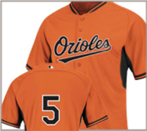
- MLB’s overall template is much better than previous year’s offerings. The jerseys appear to fully button up the front. The underarm coloring is subtle (combinations of black and white for the Orioles have been far more obtrusive in the past), and the piping around the collar and sleeves are a nice touch.
- Specific to the Orioles, I like that they went with a solid color. Some team’s jerseys have a primary color on the front and a secondary color on the back. Who would go for this kind of Garish look? Cleveland, Washington, Miami, Tampa, and Kansas City. The Orioles dodged that bullet – thanks, Birds.
- The Orioles were one of nine teams to go without name on back (or as Paul Lucas would say, NOB). I think this is a much cleaner look, but from a more utilitarian outlook, it doesn’t require the team to put effort into the names of players that aren’t going to be there very long (“OK, kid – there’s your locker. You get #73”).
Here’s where I think that the O’s missed the mark on the BP jersey:
- I liked having an away BP jersey, because it was another excuse to put “Baltimore” on the front of a black alternate look. I am predisposed to orange, but I know that there are some out there who like the orange-on-black look. These people are left out in the cold with this redesign. There are some teams who have alternate BP looks (Yankees, Brewers, Twins, Padres).
- It’s too much like the existing orange jersey. Back when we only had the home whites, away greys, and black alts, this design would have been a fine addition. But now that we’ve got an orange alternate jersey with a black “Orioles” script, this design becomes redundant.
- It doesn’t take advantage of the Orioles’ large catalog of great design. Much like my complaint about the 2013 BP caps, these jerseys would be much better off (in regards to sales and aesthetics) if they went the route that Cleveland and Milwaukee went: alternate logos on the chest. I think a jersey that prominently displayed the new Smiling Bird, the Angry Bird, or even the Maryland Flag logo would be a nice look change for this jersey.
Look, the jersey is OK, but it’s just OK. I think the Brewers nailed it, with a jersey that uses the team’s quirkiest colors and logos. Here’s what the rest of the league will look like next year:
